Problematic
We have detected that the web platform of the Revenue and Customs Control Agency (ARCA) currently presents multiple difficulties that affect the experience of its users. Among them, the complexity of locating key information, the lack of feedback in the processes, frequent errors in loading forms and documents, and a non-intuitive organization of the contents stand out. These problems cause delays, force repetitions of procedures, and increase the frustration of citizens, businesses, and professionals who rely on the system to carry out tax and customs procedures. The absence of a clear structure and a user-centered design limits the efficiency of the service and hinders the agile compliance with obligations.
Objective
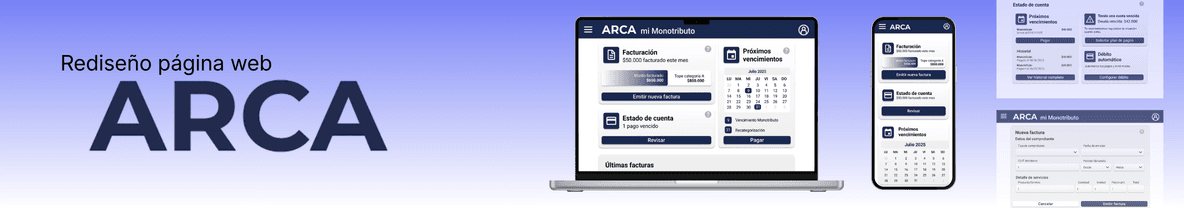
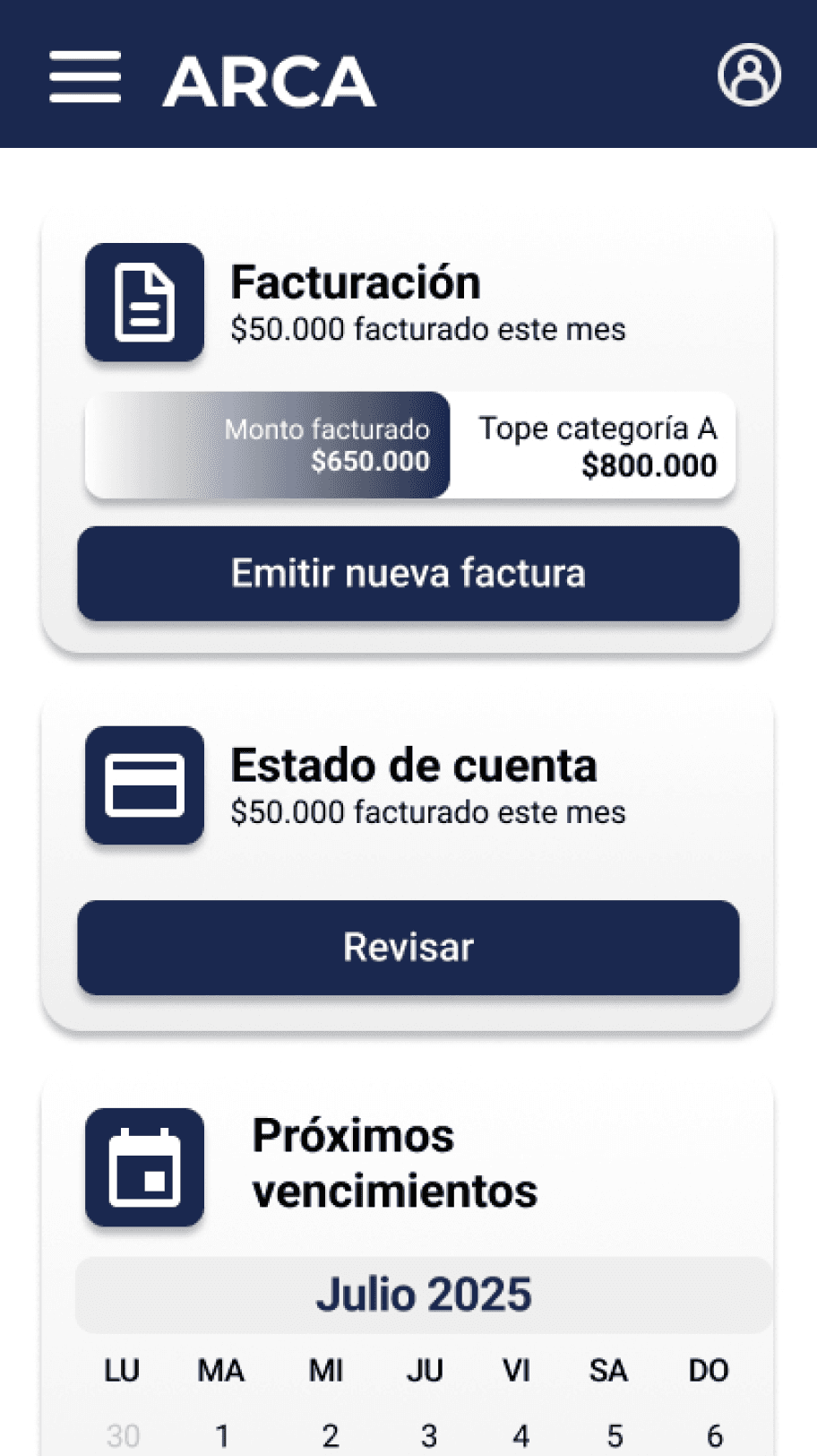
The main objective of the project is to redesign the web platform of the Revenue and Customs Control Agency (ARCA) to improve its usability, accessibility, and communicative clarity. It aims to simplify tax and customs processes, reduce user frustration, and promote a digital experience centered on people.
The new design must facilitate the self-management of procedures without external assistance, especially for self-employed individuals, independent professionals, and taxpayers with low accounting knowledge, while ensuring efficiency and institutional transparency.
Context
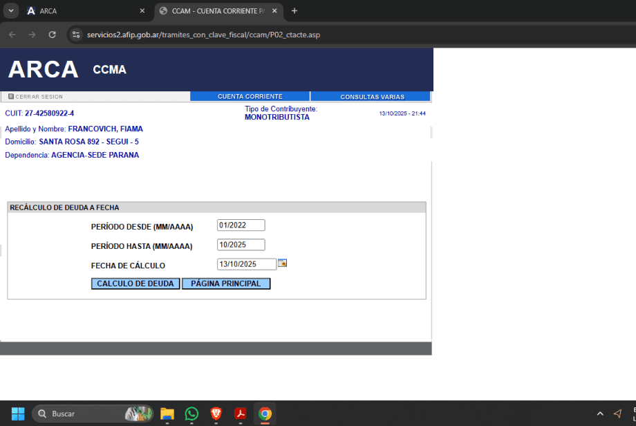
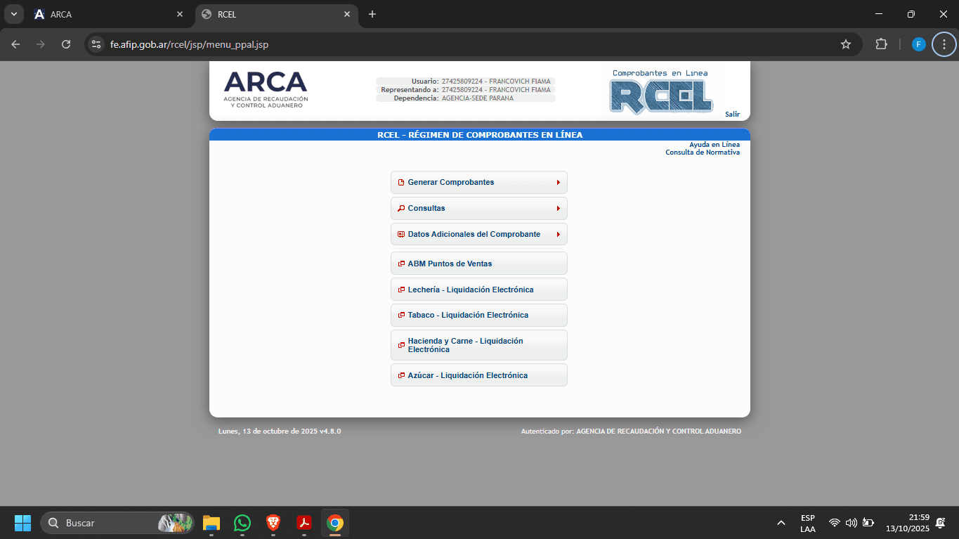
ARCA is the agency responsible for tax collection and customs control in Argentina. However, an analysis of the current experience reveals usability issues, an excess of technical information, and a navigation that is not intuitive, which generates frustration and distrust among users.
In this context, there is a necessity to reorganize the information architecture and improve visual communication in order to optimize interaction, reduce errors, and strengthen the perception of institutional transparency.
Solution
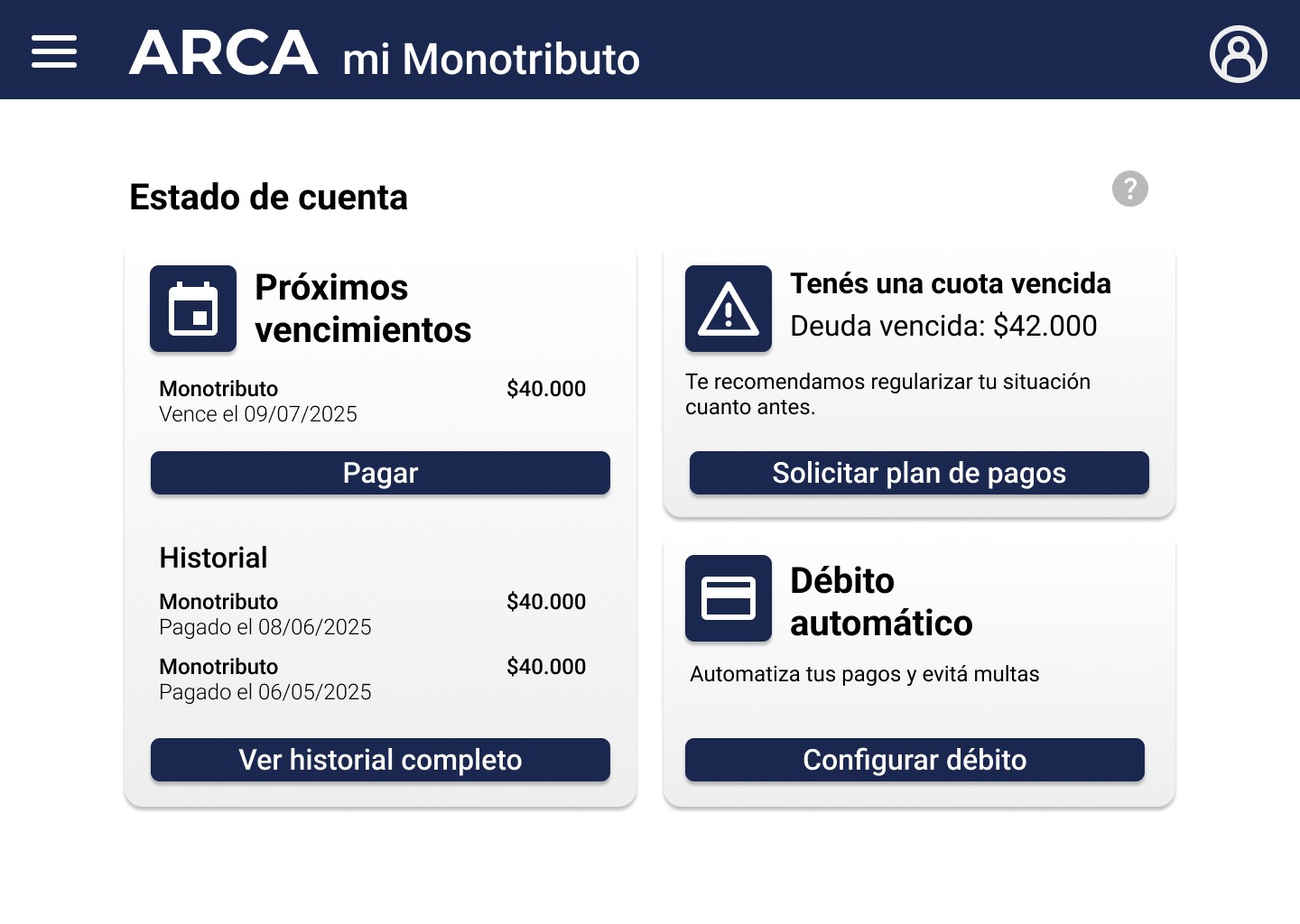
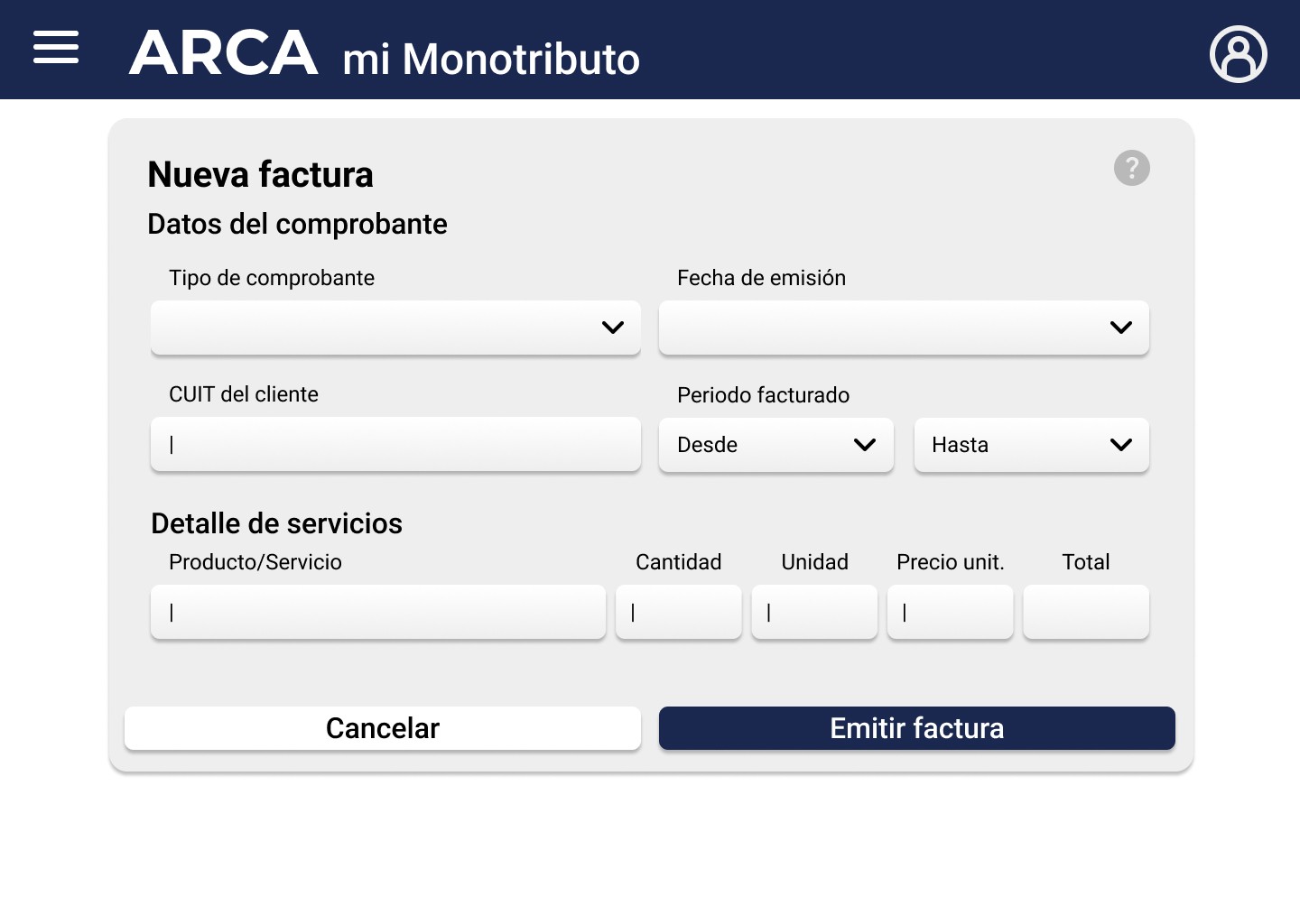
The proposal consists of a comprehensive redesign of the user experience, focused on visual clarity, functional simplicity, and communicational empathy.
Through a main dashboard with quick access, a clearer language, and contextual assistance, the aim is to offer a smoother and action-oriented experience.
In this way, ARCA will be able to modernize its digital identity, improve efficiency in the management of procedures, and increase the satisfaction and trust of its users.
Benchmarking

Trend matrix

The above
The current
The emerging
Exploratory surveys
15 people were surveyed who use the ARCA website at least once a month, 4 of whom log in several times a week, even every day.
Everyone surveyed accesses the website to carry out electronic billing, some to consult and make payments, and to a lesser extent to carry out procedures, download documentation, or search for information.
None considers that looking for the section they need is very easy or that the information on the website is completely clear and understandable.
Why do you visit the website?
How easy is it for you to find the information/section you are looking for on the website?
Did you encounter any obstacles accessing the information due to your device, browser, or special needs?
Is the information you find on the web clear and understandable to you?

Very easy
Totally agree
Easy
Agreed
Neutral
Neutral
Difficult
In disagreement
Very difficult
Totally disagree
"I think it's quite difficult to find some sections, like the monotributo one for example; it's not very intuitive."
"To pay with Mercado Pago from the mobile phone, I have to turn on the PC and scan from the mobile, it would be better to have a payment link like any other page. It is very annoying."
"There is no compatibility with some browsers, and it is also not responsive to adapt to dimensions on mobile platforms."
“When I find things, it's only if I watched a tutorial. Too little intuitive. Another thing is that maybe if you are an accountant/know about it, you can handle it calmly and without problems, but if you don't know the subject very well, it's basic Chinese, terms I don't relate to anything, a thousand actions you can do but no idea what they are or what they're for.”

Luciana
27 years old
Independent professional
Paraná, Entre Ríos.
Luciana is a young woman who a few years ago began working independently as a speech therapist. Her surprise was that the biggest challenge had to do not with her patients but with invoicing the Health Insurance companies at the end of the month, since no one indicated or taught her anything about that.
As she is starting her career and tries to save money, she prefers to forgo an accountant, so she relies on tutorials and consultations with friendly colleagues.
Motivations
Reduce the anxiety and stress caused by paperwork, so you can focus on what you truly enjoy: taking care of your patients.
Manage your business and responsibilities independently, without constantly relying on others.
Learn to manage these tools to grow as a well-rounded professional.
Goals
Understand your tax responsibility and not feel like you are going blindly.
Make the billing process more manageable.
Do not fall behind on your taxes due to lack of understanding.
Frustrations
The information is confusing and scattered, which generates doubts and anxiety.
The website does not help, many times it indicates different amounts or is down at important times.
He/she never feels secure about what he/she does there.
Skills
Social networks
Devices (Smartphones, tablets, kindle)
Professional software
"When I find things it's only if I saw a tutorial"
User persona
Empathy map


Luciana
27 years old
Speech therapist
Uses the web to invoice and pay her obligations.
Scene
It is the beginning of the month and Luciana needs to bill for the Social Works.
Expectations
Log in without issues
Invoice electronically
Navigate without issues
1- Luciana enters her CUIL.
2- Luciana types her tax ID with an error, so the incorrect password message appears.
3- Luciana must re-enter her CUIL and her password.
4- Look for the electronic billing button, it is hard to find.
5- Enter the information for the Health Insurance and the information for the services provided.
6- Confirm the invoice.
7- Note that, due to missing commas or periods between the numbers, you entered one extra 0.
8- Look for where to cancel that invoice.
9- She cannot find it.
10- Look for a tutorial.
11- She discovers that she must extend the period requested to search for issued invoices, even if she has recently generated it.
12- Generate a debit note with all the repeated information and including the incorrectly issued invoice number.
13- Prepare to invoice again, re-adding all the information, and ensuring that there are no errors.
That the system identifies which field has the error so that the user does not have to complete both again.
That the system allows remembering certain data so that, when creating many invoices, it does not have to be written over and over again.
Add a period every 3 zeros to prevent confusion with large numbers.
Simplify the vocabulary so that it's easier to find the sections.
Include simple tutorials near each function.
Ensure that the required period is appropriate, and not that it works when an incorrect date is indicated.
Add a feature that generates the debit note from the specified invoice.
Opportunities
Web page
Computer
Web page
Computer
Website
Computer
External tutorial
Web page
Computer
Contact points
1
2
3
4
5
6
7
8
9
10
11
12
13
He is frustrated that the system does not identify the error and requires him to enter his CUIL and password again.
It frustrates him that one of the most useful features is not so visible.
He gets angry for not having foreseen the error.
He is frustrated for not finding what he needs.
You have to waste time looking for a tutorial.
It frustrates him that the solution doesn't make sense.
Rewrite with a lot of fear of making a mistake again.
I think it shouldn't be that complicated.
Lean UX canvas


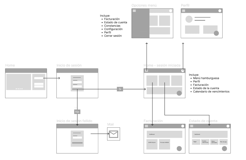
Flowchart
Design System
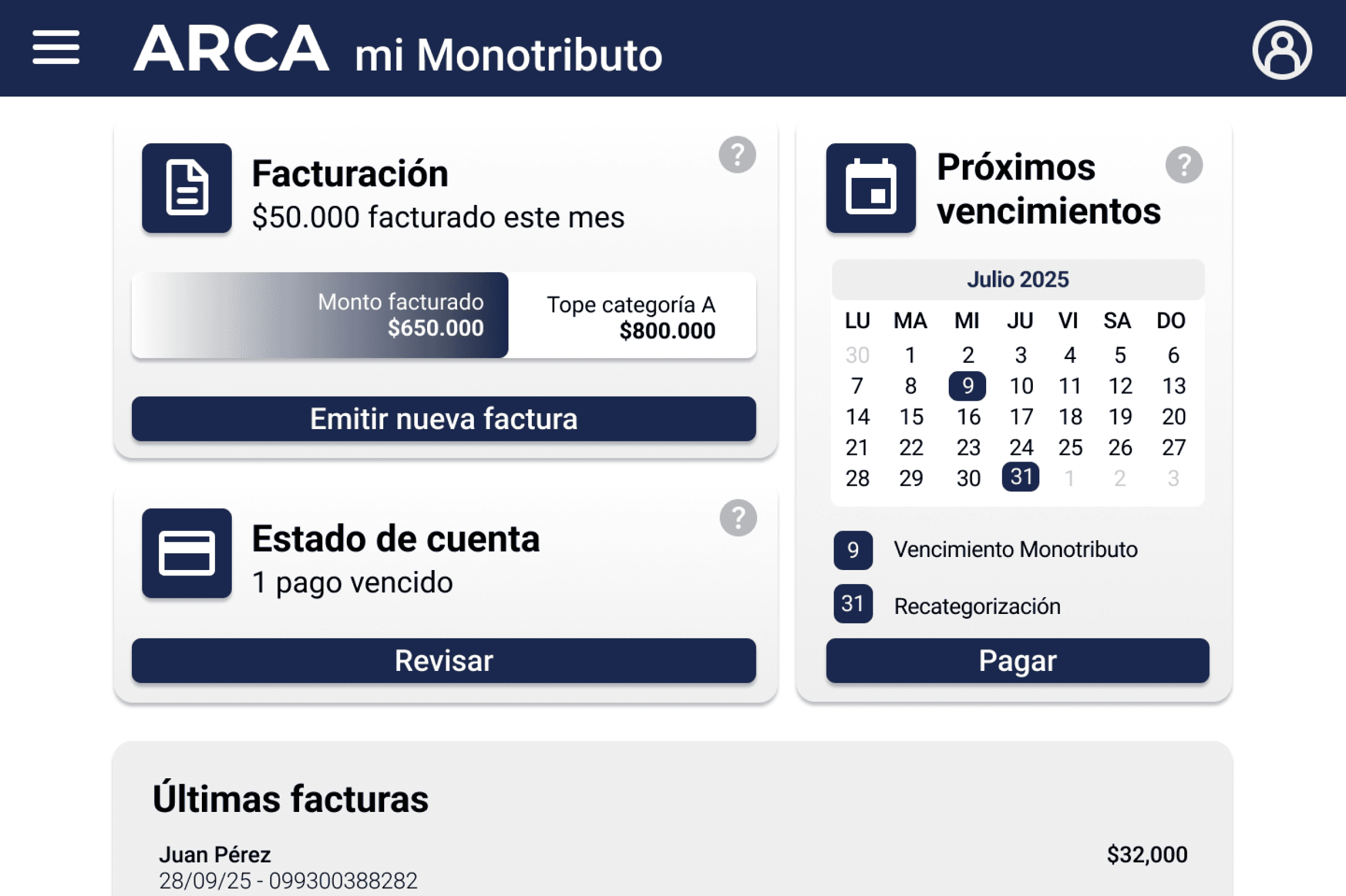
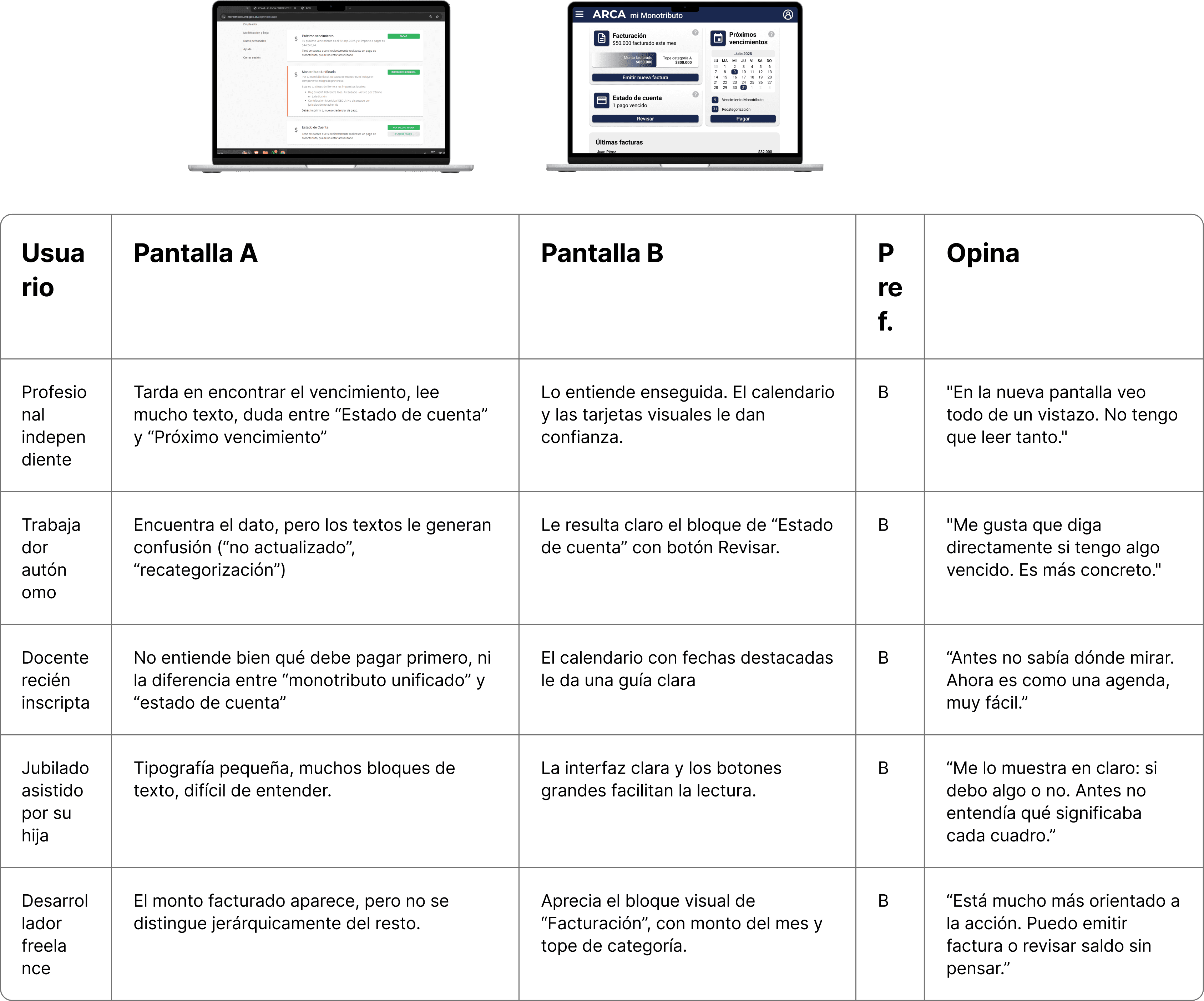
Usability tests
Conclusion
This redesign achieves the stated objectives: it simplifies navigation, improves the organization of information, and offers a clearer and more coherent experience for informal tax workers. The proposal addresses much of the friction detected in the original version and contributes to a closer and more understandable relationship between the user and the tax system.
However, there are still opportunities for improvement. The incorporation of more contextual assists, interactive help resources, and greater accessibility options would allow for a more inclusive and supported experience, especially for users with less digital familiarity or with different cognitive and motor needs.
This project aims to lay a solid foundation upon which to continue iterating towards a more human, accessible, and close platform.
Typography: Roboto
Colors
Supertitle
Title
Subtitle
Body
Bold 60px
Bold 40px
Medium 32px
Regular 24px
1A2850
000000
FFFFFF
EEEEEE
7D9FFF
B9B9B9
Icons:
Buttons
Cards
Main action
Secondary action
Title
Information
Action
Title
Action
Month - Year
LU
MA
MI
JU
VI
SA
DO
1
2
3
4
5
6
30
8
9
10
11
12
13
7
15
16
17
18
19
20
14
22
23
24
25
26
27
21
29
30
31
1
2
3
28
9
31
Event
Event
Category
Information
Category
Information
Categoria
Información
Categoría
Información
Category
Information
Main action
Secondary action


Accessibility